
Design
For BI leads, editors, visualisation coders and designers, UX/UI developers, CX analysts, business analysts, journalists, communication specialists, data scientists, and anyone who communicates a message through data in presentations, graphics, charts or articles.
Learn how companies and studios of all kinds are creating more effective visuals and dashboards for communicating data, enabling busiess decisions, and driving behavioural change. Talks discuss colour theory, design principles, storytelling and narrative design, dashboard creation, user testing and feedback, customer journey mapping, and the visualisation of different kinds of data - networks/relationships, geospatial, statistical and more.

-
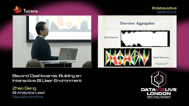
Design and Principles in Exploratory Data Visualisation
For this talk, I will focus on the design principles and guidelines when developing a dashboard for business to better align with the visual Information-Seeking mantra, namely ‘overview first, zoom and filter, detail on demand’. A few of the theoretical studies will be discussed to avoid some maj...
-
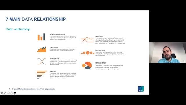
Effective Data Presentation in PowerPoint
Clever Ways to Present Data Effectively in PowerPoint
Data presentation tips and tricks, and learn how to properly dissect data and visualise charts and tables, to to create clean and effective data presentation in PowerPoint.
-
Beyond Colour Myths: Functional Aesthetics for Better Design
How much does colour affect our understanding of dashboards? We know bad choices in palettes can definitely break a good dashboard. Join Bridget to learn about avoiding poor colour choice, and how to use function aesthetics to enhance your visualisations.
-
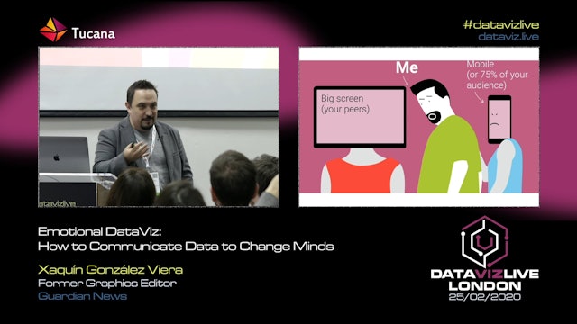
Emotional DataViz: How to Communicate Data to Change Minds
How do we connect humans and data about humans? In a world of abundant data about events, about changes in our social and physical environment, making sense of the noise, annotating the chaos is a fundamental communication task.
Data-driven visual storytelling is a powerful way to affect people’...
-
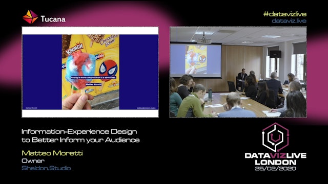
Information-Experience Design to Better Inform your Audience
Engage and inform your audience with immersive and memorable deisgn experiences
Through a series of case study across the industry and the academic research, the talk will show the results of six-years long research across information, design, and experience design, to design projects that infor...
-
Teaching Tekken’s Game Mechanics Through Data Visualization (Jayne Zhang)
A huge problem industry professionals have is that we are often followed by peers, not by people who would want to hire us for our work. This becomes problematic because our work isn’t targeted at people in our industry, it’s often targeted at people outside of it.
This project aimed to visualis...
-
New, Art-Inspired Approaches in DataViz (Stefanie Posavec, Miriam Quick)
Miriam Quick is a data journalist and researcher and Stefanie Posavec is a designer and artist. They have spent much of their shared practice exploring how to move data visualisation 'beyond the bar chart' and extending what is possible in the realm of presenting and experiencing data.
Alongside...
-
Offline Marketing & Digital KPI's: How can you Bridge the Gap? (Alice Speranza)
Linking offline marketing activities to digital engagement KPIs can often be a challenge for marketing teams, especially when campaigns are executed by external agencies, who might not have access to useful data points and knowledge.
This presentation will talk about how The Economist data team ...
-
Colouring with Data (Alan Wilson)
Colour is a powerful but dangerous communication tool. In this session, Alan Wilson, one of Adobe's most senior design leaders, explains how to use colour effectively when visualising data. He also shows the perils of incorrect colour choice, and when not to use colour at all.
-
Beyond Open Washing: Are Narratives the Future of Open Data Portals?