Beyond Colour Myths: Functional Aesthetics for Better Design
Design
•
31m
How much does colour affect our understanding of dashboards? We know bad choices in palettes can definitely break a good dashboard. Join Bridget to learn about avoiding poor colour choice, and how to use function aesthetics to enhance your visualisations.
Up Next in Design
-
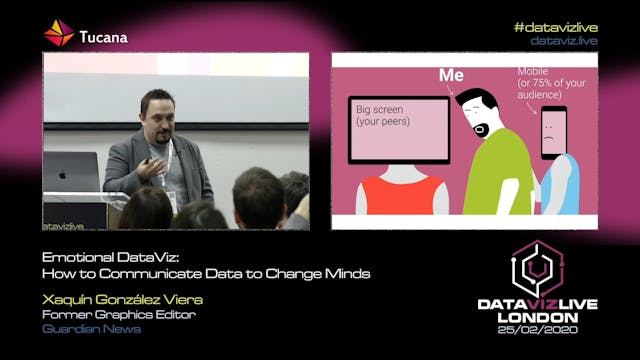
Emotional DataViz: How to Communicate...
How do we connect humans and data about humans? In a world of abundant data about events, about changes in our social and physical environment, making sense of the noise, annotating the chaos is a fundamental communication task.
Data-driven visual storytelling is a powerful way to affect people’...
-
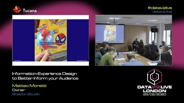
Information-Experience Design to Bett...
Engage and inform your audience with immersive and memorable deisgn experiences
Through a series of case study across the industry and the academic research, the talk will show the results of six-years long research across information, design, and experience design, to design projects that infor...
-
Teaching Tekken’s Game Mechanics Thro...
A huge problem industry professionals have is that we are often followed by peers, not by people who would want to hire us for our work. This becomes problematic because our work isn’t targeted at people in our industry, it’s often targeted at people outside of it.
This project aimed to visualis...