Design and Principles in Exploratory Data Visualisation
Design
•
29m
For this talk, I will focus on the design principles and guidelines when developing a dashboard for business to better align with the visual Information-Seeking mantra, namely ‘overview first, zoom and filter, detail on demand’. A few of the theoretical studies will be discussed to avoid some major design pitfalls
- Visual Information Seeking Mantra
- Visual Continuity
- Focus+Context
- Preattentive Perception
- Color Mapping
Explore options and techniques to achieve better data visualizations for exploratory purposes.
Up Next in Design
-
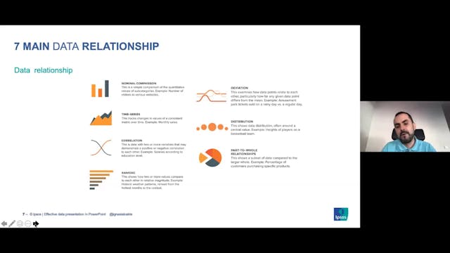
Effective Data Presentation in PowerP...
Clever Ways to Present Data Effectively in PowerPoint
Data presentation tips and tricks, and learn how to properly dissect data and visualise charts and tables, to to create clean and effective data presentation in PowerPoint.
-
Beyond Colour Myths: Functional Aesth...
How much does colour affect our understanding of dashboards? We know bad choices in palettes can definitely break a good dashboard. Join Bridget to learn about avoiding poor colour choice, and how to use function aesthetics to enhance your visualisations.
-
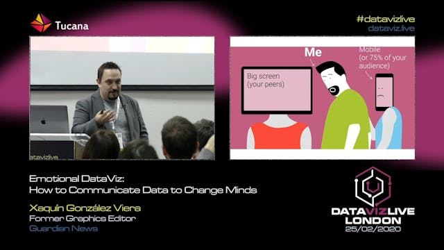
Emotional DataViz: How to Communicate...
How do we connect humans and data about humans? In a world of abundant data about events, about changes in our social and physical environment, making sense of the noise, annotating the chaos is a fundamental communication task.
Data-driven visual storytelling is a powerful way to affect people’...