Live stream preview
How much does colour affect our understanding of dashboards? We know bad choices in palettes can definitely break a good dashboard. Join Bridget to learn about avoiding poor colour choice, and how to use function aesthetics to enhance your visualisations.
Up Next in May 2020
-
Effective Data Presentation in PowerP...
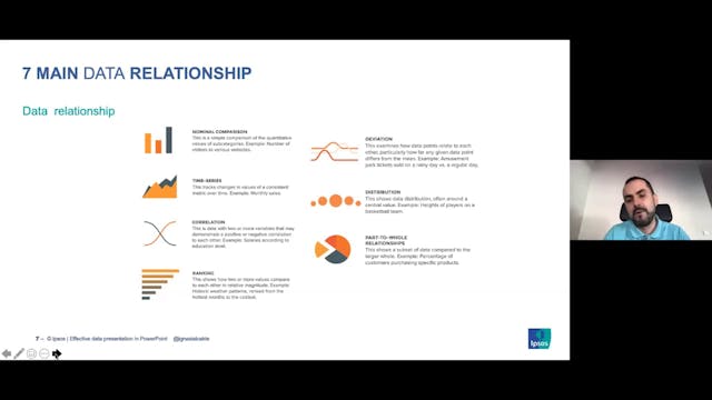
Clever Ways to Present Data Effectively in PowerPoint
Data presentation tips and tricks, and learn how to properly dissect data and visualise charts and tables, to to create clean and effective data presentation in PowerPoint.